It sounds counterintuitive, but sometimes making things easier for users can backfire. I just came across a great example of this on LinkedIn: a team added a simple “What size do you need?” filter to an online shoe store, and revenue dropped by over 8%.
You’d think helping users filter quickly would improve conversions, right? That’s what Hick’s Law would suggest: fewer choices = faster decisions. But in this case, the opposite happened. Users saw fewer shoes, perceived less variety, and bounced.
This was pointed out by a Linkedin User:

This is where Hick’s Law meets its more emotional sibling: the Paradox of Choice. Sometimes users want to explore, browse, feel like they’re in control—even if it takes more time.
The Theory in Play
Hick’s Law tells us that the more choices we offer, the longer it takes to decide. It’s a principle often used in UX to guide users toward quick action. On the other hand, the Paradox of Choice suggests that limiting choices too early can actually reduce engagement. People like the feeling of freedom and exploration, and if that’s taken away, the experience can feel restrictive rather than helpful.
- Hick’s Law tells us that limiting options can help users make faster, more confident decisions.
- The Paradox of Choice tells us that too few options can make users feel constrained, unfulfilled, or even disengaged.
These aren’t contradictions. They’re complementary forces. One favors speed; the other values experience.
When Less is More: Hick’s Law in Action
Let’s start with situations where simplicity truly helps. Think about a landing page that only gives you one clear action: “Start Free Trial.” There’s no confusion, no distractions, just one path forward. It works because the goal is action, not exploration.
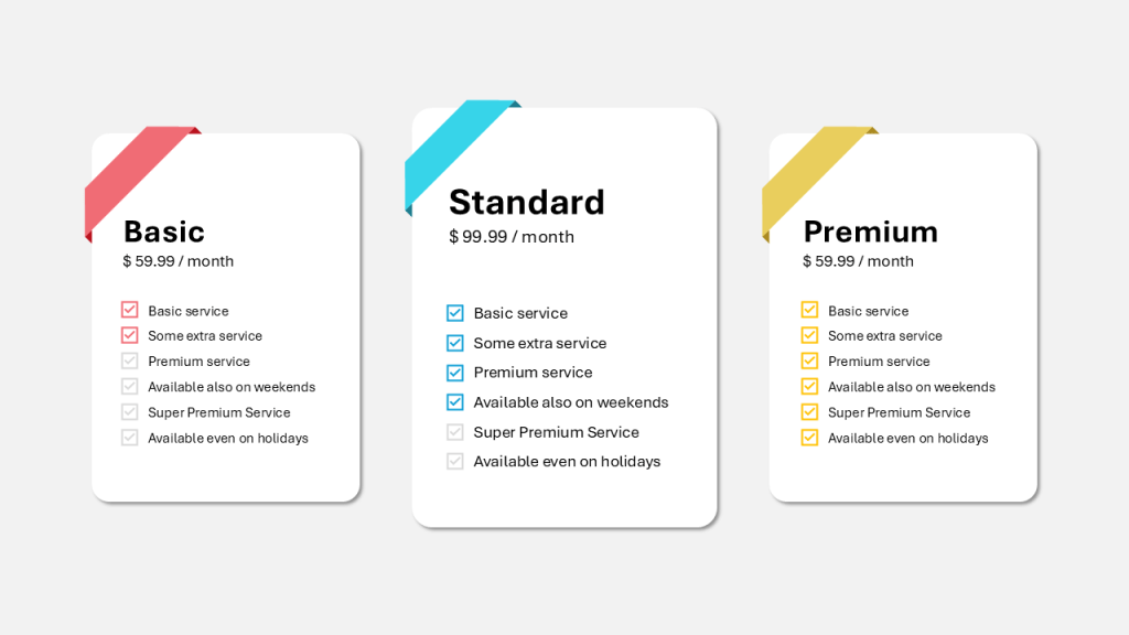
The same applies to pricing pages that offer three clear options—basic, pro, and enterprise. You’ve probably noticed that these setups guide your decision almost intuitively. That’s Hick’s Law doing its job, reducing mental effort and increasing clarity.
It also shines in mobile app onboarding. Users don’t want to be overwhelmed during the first few minutes with an app. A short, guided setup gets them to value faster. Even physical examples follow the same logic. Take restaurant kiosks, for instance. Showing a few top categories instead of the full menu helps users start the order process without feeling stuck.
These work because the user wants clarity and momentum:
- A landing page with one clear call to action (“Start Free Trial”)
- Three pricing tiers—no more, no less
- Simple onboarding flows with minimal steps
- Restaurant kiosks with only a few top categories shown first
When More is More: The Paradox of Choice in Action
But not everything works better when it’s simplified. There are moments when offering more options makes people feel empowered and curious. E-commerce is a great example. Imagine browsing for a new pair of sneakers. If the site forces you to select your shoe size before showing anything, you might miss out on styles that you didn’t even know you wanted. The limited view reduces the sense of abundance, and you end up thinking there’s not much to choose from—even if there is.
Streaming services are another case. While personalization is important, overly curated suggestions can feel stale. People enjoy scrolling, comparing, and sometimes even finding something unexpected. It’s the act of browsing itself that adds to the satisfaction.
I’ve seen this happen in the travel industry as well. When you’re planning a trip, sometimes you want inspiration more than filters. A “show me everything” approach can spark ideas and push users to consider destinations they wouldn’t have selected in a strict search. And in job platforms, forcing candidates to filter by location, title, or salary right away might eliminate roles that would have been a great fit—but didn’t appear under narrow criteria.
In these situations, simplifying too soon kills the joy of discovery:
- Browsing shoes, jackets, or tech products—users want to “see it all” before filtering
- Netflix recommendations—too much filtering can feel limiting
- Travel booking—some inspiration and exploration improves the experience
- Job portals—early filtering might make you miss something unexpected
In these cases, a “just tell me what you have” mentality is often stronger than “help me choose fast.”

Choices in the Boardroom vs. the Workshop
This concept doesn’t just apply to digital products. It’s something I’ve seen repeatedly in real life, especially when dealing with leadership and decision-making.
Earlier in my career, I learned that when you’re presenting a solution to your boss, it’s (please take this with a pinch of salt… maybe not always) much better to show two options. It gives them a sense of control and engagement. They can choose between A or B, or, as I experienced many times, come up with a third alternative that’s either a combination or an improvement of the first two. Funny enough, whenever I presented what I believed to be the best option right away, skipping the “choice architecture,” I often had to rework everything and come back with something new. It wasn’t about the quality of the solution—it was about the dynamic of the decision.
But the opposite happens in workshops or when presenting to a bigger audience. In those cases, two options feel narrow and even dismissive. People want to see a range. They want to feel part of the process, to discuss, refine, and shape the direction together. In those moments, offering more possibilities doesn’t slow things down, it opens up collaboration. It creates buy-in.
So, just like in UX, the number of choices we present isn’t about simplicity vs. complexity, it’s about context.
Test Everything, Especially the “Obvious”
This isn’t about choosing between Hick’s Law or the Paradox of Choice. It’s about recognizing when each one applies. And more importantly, it’s about questioning our own assumptions.
What feels intuitive to you, or to your team, might be completely off when it meets real users. A “smart” improvement can break the journey. A filter can reduce value. And what you believe to be helpful might not be helpful at all.
So the next time you’re simplifying, ask yourself: am I making it easier to act, or am I taking away the thrill of the journey?

Leave a comment